Principle of disclosure
Read time: 5 minutes
On this page
Overview
Definition: Show only enough information to help the user understand what kind of information they’ll find as they dig deeper.
In practice: Progressive disclosure is about presenting only the amount of information the user needs to complete a given task. Additional information can be found in layers below that page. Show the appropriate information, not necessarily less information.
This is supported by:
- Krug’s first law
-
Definition: Don’t make me think.
In practice: Most sites are crowded with text and images – including menu bar navigation, side menu options, main content, secondary content, flashing ads, and so on. It can be hard for a user to quickly process what’s important. As they scan across the page, many questions pop up in the users’ mind.
- Krug’s second law
-
Definition: It doesn’t matter how many times I have to click, as long as each click is a mindless, unambiguous choice.
In practice: Users prefer easy choices. They want mindless clicks if the task completion requires numerous pages.
- Fitt's law
-
Definition: The model of human movement primarily used in human–computer interaction and ergonomics. This scientific law predicts that the time required to rapidly move to a target area is a function of the ratio between the distance to the target and the width of the target.
In practice: The bigger an object and the closer it's to us, the easier it's to use it. Keep choices to a minimum in order to expose the most amount of items within the viewport. Remember that there are different viewports depending on the user's screen resolution, device, and font size.
Examples
Passing examples
-
Passes: Only the top level tasks are featured on this Canadian citizenship page. The links are clear and don't overlap, meaning the user can anticipate what information is available at the next level down.
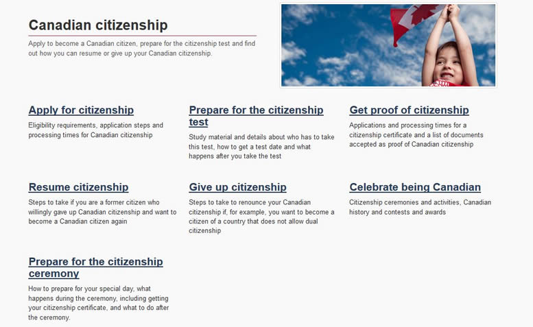
Remember: Only provide enough choices to help the user understand and make an informed decision.
Failing examples
Disclaimer: Examples below are used for learning purposes to illustrate broken principles and their potential consequences, not to judge the organizations or people designing these interfaces.
-
Fails: This page has general health resources of which 3 are child specific:
- "Sleep safe"
- "Childhood obesity"
- "Infant care"
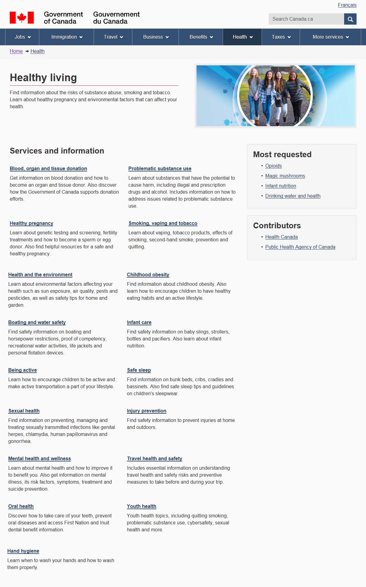
Instead of showcasing all three on this page, it makes sense to group them under a broader category that focuses on that audience segment. For example, "Healthy children" or "Childhood health".
Once you formed a new grouping, it would become more apparent that there is some overlap between "Infant care" and "Safe sleep". You would then need to tackle this problem and likely make "Safe sleep" a sub-category (child page) under "Infant care".
"Youth health" makes sense as a standalone category, as this group is unlikely to see themselves as "children" and shouldn't be lumped together. You would want to make this category parallel with the childhood equivalent. So the options would be "Youth health" and "Childhood health", or "Healthy youth" and "Healthy children".
Remember: When links compete with each other, the user cannot get a sense of what each link’s distinct purpose is. Therefore, the user cannot anticipate what they will find if they dig deeper.
-
Fails: This jobs page features 2 links that compete when featured at the same level:
- "Job Bank"
- "Find a job"
Do you go "Find a job" by using the "Job Bank", or do you go to the "Job Bank" to "Find a job"?

Additionally, when you go into "Find a job" page, the "Job Bank" is the first item. This breaks the hierarchy of IA, because "Job Bank" can't be an equivalent on the page above and then also made a child here:

Remember: While it's common to want to showcase popular items, they should go in a section like "Popular links" and not be put in the space where the overall structure of the website is presented at a glance (unless of course, this popular item also happens to be the high-level category of information).
-
Fails: There are a few IA concerns on this page:
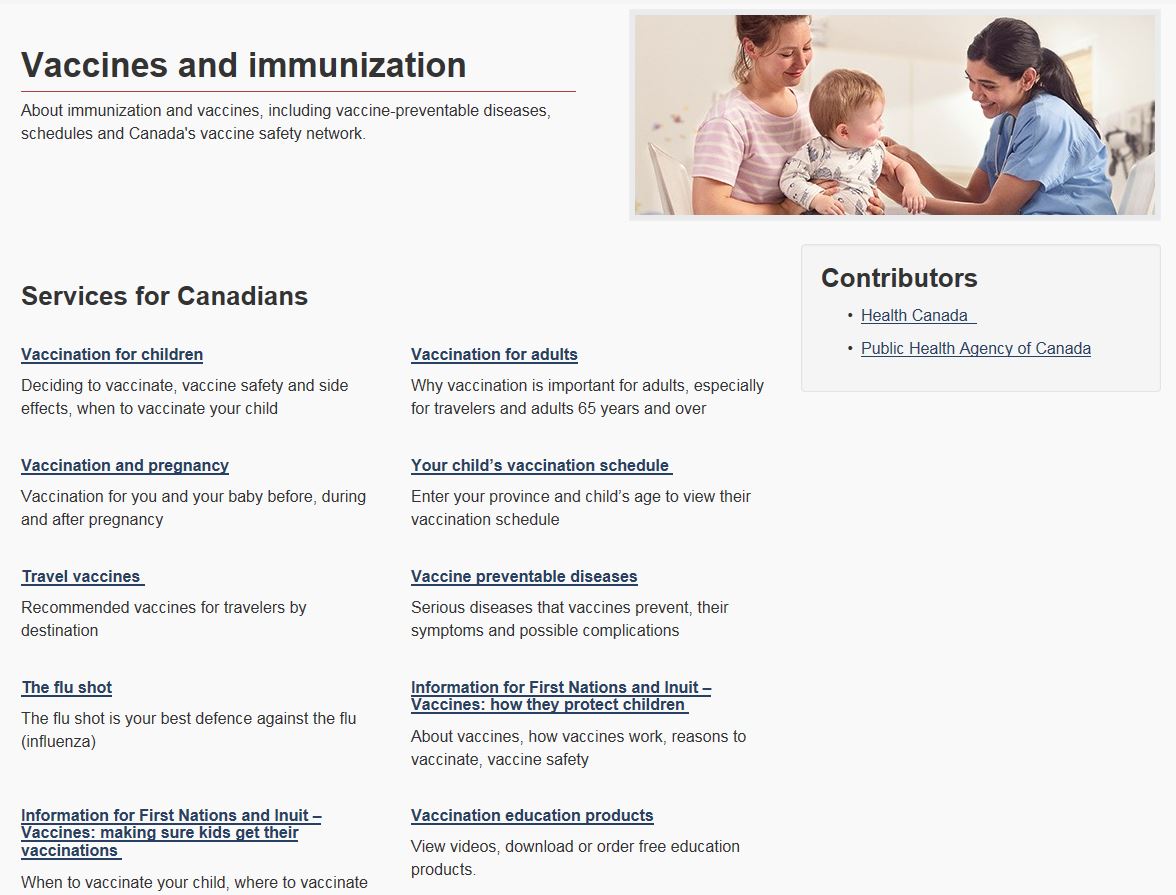
- There is a broad category of "Vaccine preventable diseases" and flu is one of these diseases, yet "The flu shot" has been elevated to the same level. This could be because it's a popular item and maybe because people don’t see flu as a disease. This may have been an attempt to solve a problem, but it seems like the solution didn't take on a whole-website-approach; there may have been other ways to resolve this in further exploring the difference in language around "vaccination" and "immunization" which may be an issue.
- There is a broad category of "Vaccination for children", yet children-themed sub-categories have been surfaced to the same level:
- "Your child’s vaccination schedule"
- "Information for First Nations and Inuit – Vaccines: how they protect children"
- "Information for First Nations and Inuit – Vaccines: making sure kids get their vaccinations"
Keep in mind that if the search engine took the user directly to the "Vaccination for children" page, they are cut off from access to these three children pages because they weren't featured at the right IA level.
Also, what is the difference between these two pages: "Information for First Nations and Inuit – Vaccines: how they protect children" and "Information for First Nations and Inuit – Vaccines: making sure kids get their vaccinations", as they seem to almost entirely overlap?
Remember: Often, the elevation of content to a higher IA level is a by-product of having a business need to showcase specific content to maximize its exposure. The trick is to balance the business need with user needs via IA principles, and come up with a solution that meets both.
Take aways
The goal of this principle is to show only the necessary information to let the user make an informed choice. In order to achieve this, you must ensure that:
- choices are logical
- choices don't compete or conflict with each other
All course sections
- Date modified: