Principle of choices
Read time: 11.5 minutes
On this page
Overview
Definition: Create pages that offer meaningful choices to users. Keep the range of available choices focused on a particular task.
In practice: Since users have a limited cognitive capacity to consider their options and then make a decision, pages should limit the amount of choices presented. The choices need to be clear, non-competing, and logical. The more choices a user has to pick from equals more mental work for that user. Always aim for a site experience that is effortless and easy.
This is supported by:
- Hick's law
-
Definition: There is a direct relationship between the amount of information a person has to process and their reaction time. So the more possible choices you make available to a person, the longer they will take to make a decision.
In practice: An increase in options results in a more difficult user experience.
- Occam’s razor
-
Definition: Among competing hypotheses, the one with the fewest assumptions should be selected.
In practice: The simplest solution is almost always the best. Significantly improve the value of a page by removing all unnecessary content. This means being ruthless about what stays on the page and what gets removed.
The principle of choices has a close relationship with the principle of disclosure. Once you make a choice, the next page discloses the next level of choices.
For example, if you go to a clothing website looking for men's bootcut jeans, your IA options to make a choice from would be something like "Women", "Men", "Youth", "Toddler", and "Baby". You would choose "Men" and the next page would disclose the next level of choices, being men's items like "Shirts", "Pants", "Shoes", etc., and you would choose again, this time "Pants". The pants page would then disclose the next level of choices and you would choose again. This back and forth dance between choices and disclosure would repeat until you get to the content page you wanted.
If choices and disclosure align well with users' mental models and there is a strong scent of information, it doesn't matter how many times they have to click until the get to the right information; the 3-click rule won't apply.
A link is a promise [...]
Any broken promise, large or small, chips away at trust and credibility. The words in a link label make a strong suggestion about the page that is being linked to. The destination page should fulfill what the anchor text promises.
Examples
Passing examples
-
Passes: A reasonable amount of non-competing choices is presented (although not in the most logical order: the process of getting Canadian citizenship is interrupted by resuming and giving up citizenship). The topic has been broken down into the various phases of the citizenship process, so it helps guide the user to make the choice that applies to their task.
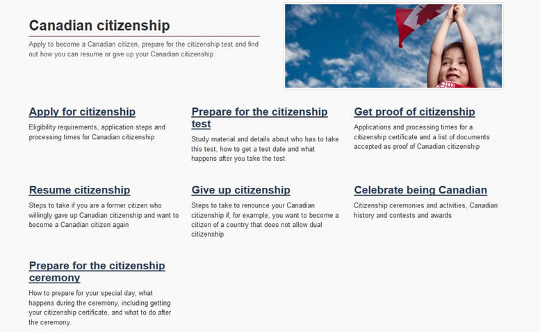
Remember: Categories shouldn't compete with each other.
-
Passes: Despite a large amount of choices, which would normally risk user confusion, these are parallel and equivalent choices. The users don’t have to read each choice before making a decision, they already know the language they want and they would scan for that language easily in this hybrid regional/alphabetical structure.
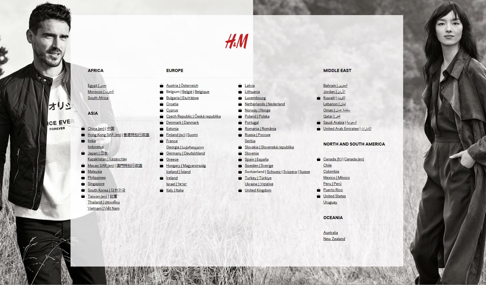
Remember: There is no rule on how many choices are too many. That said, the more choices, the greater the risk of creating user confusion.
Keep in mind that from a cognitive perspective, recognition is always better than recall and that people can effectively keep up to 7 pieces of information in their short-term memory.
-
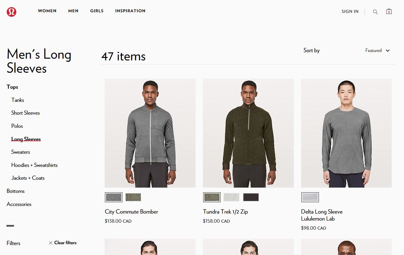
Passes: From the homepage menu, there are limited and logical choices, so after selecting "Men"

...and then selecting "Tops", followed by "Long sleeves" (with each of these pages also having limited and logical choices)
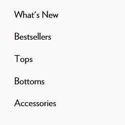
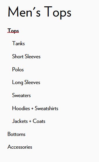
... we arrive at the "Men's Long Sleeves" page. Up until now, the choices have been effortless and easy, but now we arrive on a page with 47 results, which would typically fail the principle of choices.
However, a further level of IA to break down long sleeve shirts into sub-categories wouldn't be useful to the user. It would be trivial to create sub-categories like "Full zipper long sleeve shirts", "Zippered-neck long sleeve shirts", and "No zipper long sleeve shirts" just to reduce the number of initial options. At some point, on some pages, when the user is closer to the point-of-need, there may be a time when lots of choices is the correct way to structure the content.
It doesn't usually help the user to display too many options, but in this case, it's successful.
Remember: Don't over-architect the content simply because there are a lot of choices, consider the context and the audience. User-testing would help determine when to add more structure and when to display everything at once.
Failing examples
Disclaimer: Examples below are used for learning purposes to illustrate broken principles and their potential consequences, not to judge the organizations or people designing these interfaces.
-
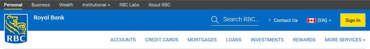
Fails: The bank's horizontal menu ran out of room when featuring the site topics, so what didn't fit in the available space was put in a "More services" item.
This creates the following:
- "More" is never an effortless or easy choice for the user, as they cannot see all the choices at a glance.
- This treatment of menu items also has the following implications:
- Menu items featured before the "More services" also become services by affinity. However, the menu items like "Accounts", and "Rewards", aren't actually services, they simply have a service component to them (in addition to lots of non-service resources).
- Featured items are positioned and perceived as more important than those hidden under "More services". This can result in users missing the hidden information.
- Items in the "More services" drop-down, like "Newcomers to Canada" (audience), and "Discover & learn" (blog) are also not services, they may just have a service component to them.
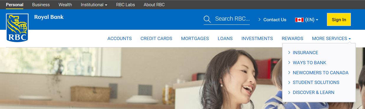
Remember: Adding a "more" (or other words that allow you to cut the information flow at an arbitrary point), can be problematic from a sensemaking perspective and can make it difficult for the user to make effective choices. Additionally, be mindful of link text and what expectations it creates about the content of your site.
-
Fails: When products are branded, there is a good chance that the bulk of typical users won't understand or associate the catchy branded name with the product. Here are two examples of branded products getting in the way of the user making effective choices:
- Featured in the right menu of this page, are two branded applications:
- "My Account"
- "My Business Account"
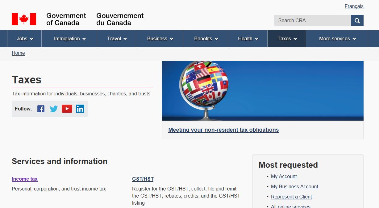
The wording "My Account" is broad enough to suggest all of your tax-related account information is there.
A user might have both personal and business tax accounts and "My Account" (or ideally, "My Tax Account") might resonate with them as the place to go to for all their tax needs.
Also, every user would have a personal tax account, but not every user would have a business tax account; so it makes sense to have a single tax account with a potential for sub-options.
However, "My Account" is only for personal taxes and business tax information is only accessed from "My Business Account". There is a mental model disconnect.
The label chosen for the account is also not descriptive enough to be clear about the purpose of "My Account", especially when it's presented next to "My Business Account" and even more so, when it's considered in relation to other accounts across the government like "My Service Canada Account". If both types of tax accounts were to be retained, a better naming convention would be:
- My Personal Tax Account
- My Business Tax Account
-
The site works well except there is an unexpected menu item, called "Divided", located right between "Women" and "Men". The user is left to guess what "Divided" means. Is it for non-binary gender identities, given its placement between women and men?
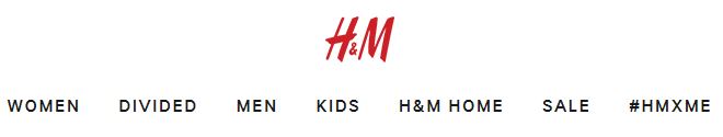
It turns out that it's an in-house brand that they have profiled in the global menu. The collection is described as a streetwear concept branch that "pads the wardrobes of college students everywhere, rivaling Forever 21 for most affordable purchase". Nothing to do with gender identities.
Not only does this not meet the principle of choices, as "Divided" isn't effortless and easy to understand in their menu, it singles out one in-house label when in fact, they have several within their site. This creates an inconsistent IA model for users trying to shop their in-house brands, of which they have several:
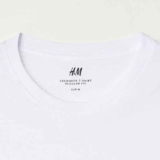 H&M
H&M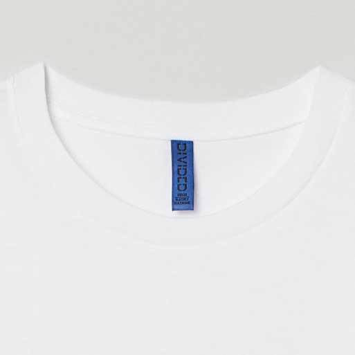 H&M Divided
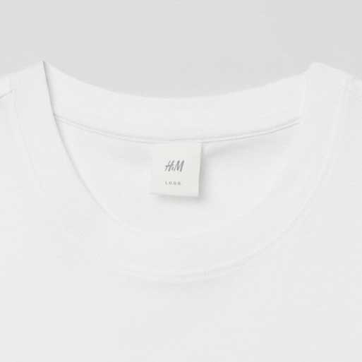 H&M L.O.G.G.
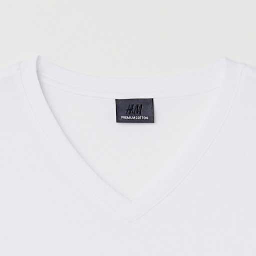 H&M Premium
More importantly, what about ethics and our earlier anticipation of "Divided" potentially being a gender category; its placement just seems too intentional. Is this an honest mistake/coincidence or a misleading dark pattern aimed at getting more purchases?
Remember: Branded products should be named and placed in a way that is in-line with full site’s IA and user experience.
Adhering to this IA principles may be less important to commercial enterprises, as they are in the business of making profit. For the public sector, users' goals and needs must come before any internal competition or promotional needs of the organization.
- Featured in the right menu of this page, are two branded applications:
-
Fails: Many content authors and webmasters forget that the content they create, while it may make sense in the flow of the localized content they create, may lose context when the user searches for information. This means that page headings have to be named uniquely and with context.
In this case, the Canada.ca site has so many "Contact us" pages, without the additional information in the title as to who is being contacted, that the results search engine returns makes it impossible for users to make informed and effortless choices.
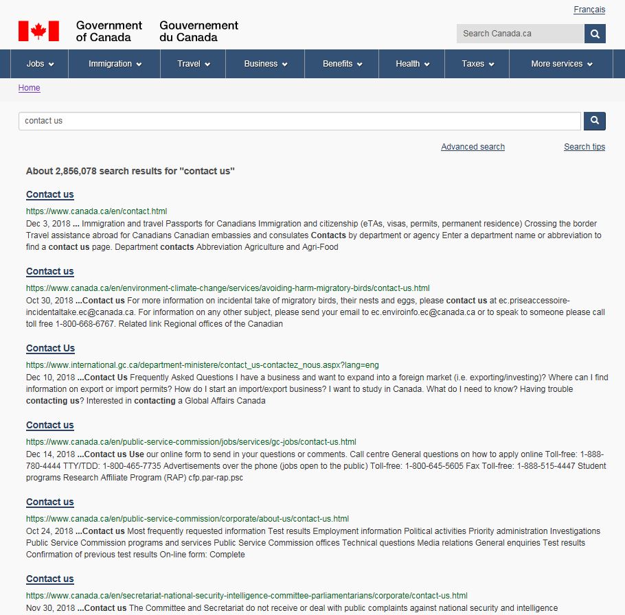
Remember: The name given to the page becomes what other pages call it when they link to it. Therefore, the page heading must be descriptive, unique, and aware of how it fits into the whole site or information system made up of multiple sites. A page title might make sense in the context of the page or on the parent page that linked to it; however, it might not make sense when seen in search results.
-
Fails: This example comes from a page that is trying to create awareness about finances for the general public.
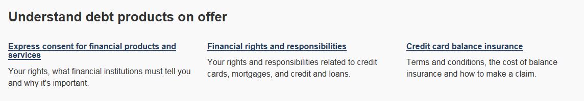
The first link on the page is: "Express consent on financial products and services". When considered in relation to 2 other links, it appears that the word "express" is used as an adjective describing "consent" and not a verb "to express".
The general public's mental model for something that is "express" is equated with being quicker (express check-out, express delivery, express lane etc.), whereas in reality, the link is using the word express to mean "explicit" rather than implied consent.
"Express consent" is a "permission for something that is given specifically, either verbally or in writing." This may be a common term in some industries, but not a plain language term many users would be familiar with. A better approach may be to remove the word "express" from the link and add detailed clarification on the resulting page, after the user selects the link.
Given the goal of the page is to reach the most people, there is a risk a portion of the users would misunderstand the link and either skip it, or click on it and be frustrated it didn't meet their expectations.
Another problem is that two first links are overlapping in content, seemingly dealing with the same topic "your rights". This is a major cause of user confusion and frustration.
Remember: Don't complicate the link text. If more context is needed, you can always provide it on the resulting landing page. Aim for simplicity, clarity and most importantly, uniqueness of page contents and the resulting link labels.
Take aways
The goal of this principle is to create meaningful choices for the user. In order to achieve this, you must ensure that:
- content and links fit into the whole of the site, from both navigation and search engine perspectives
- link text accurately reflects the content it's linking to
- link text isn't vague or confusing
- page headings are clear and unique, as they become the link text other pages use when referring to that page
- number of link options on a page is optimized based on content type, context and users
- sub-categories don't compete with each other or with their parent category
- branded content is limited and assessed for user confusion it may cause
All course sections
- Date modified: