Principle of growth
Read time: 6 minutes
On this page
Overview
Definition: Assume the content you have today is a small fraction of the content you will have tomorrow.
In practice: Designing content page-by-page isn't strategic, as a site grows over time. Patterns, templates, navigational systems, and the content itself must anticipate the ways in which the site might grow. It must use a strategic plan to allow for that growth.
For most websites, content is an organic and inconstant entity. The complexity or amount of content featured on a website this year is unlikely to stay the same next year.
This means that it's important to manage your content in a flexible manner. The search tools and overarching data framework that you implement should be inherently scalable, so that it can grow to assimilate large amounts of new content with little effort.
You need to take the time to think about the type of content which could feasibly [be] incorporated in future years, and this needs to relate to completely new content categories, as well as expansions of the ones already featured on the website. it's a good idea to consider how this new content will link with existing content, the ways in which they could complement one another, and the manner whereby they could be assimilated easily with no need for a site overhaul.
The principles outlined are essential when it comes to constructing successful data hierarchies. Whilst some will undoubtedly be more useful than others, for specific tasks, the ability to think about and evaluate every one of them is something which will lead to more streamlined data approaches. As all designers should know, an improved data hierarchy is a good way to up user satisfaction.
Examples
Passing examples
-
Passes: The design of the page easily accommodates the addition of more navigational items, as needed.
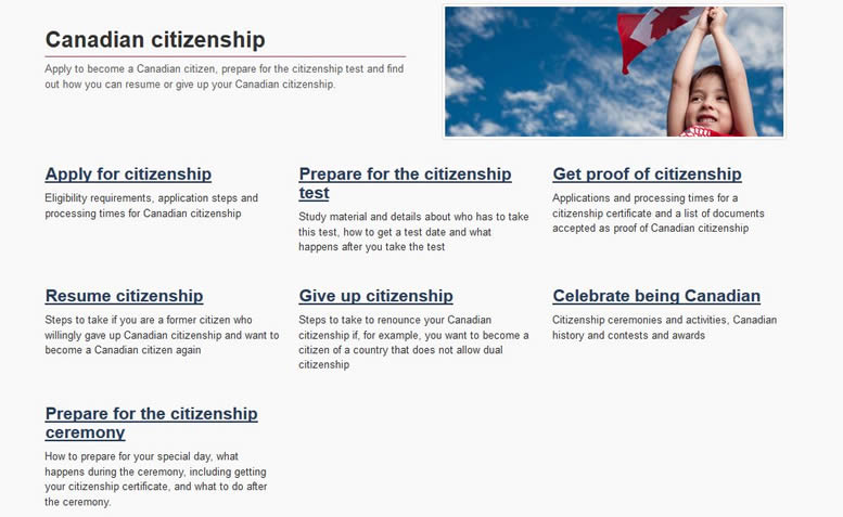
Remember: Government websites are growing, not shrinking or plateauing. Therefore, design and plan now for future content additions and don't simply design for today's information. That said, government should really adopt a content maintenance rather than a "content growth" approach to improve user experience.
Failing examples
Disclaimer: Examples below are used for learning purposes to illustrate broken principles and their potential consequences, not to judge the organizations or people designing these interfaces.
-
Fails: By default, tabs display horizontally on the computer screen, which means there are only a handful of tabs that fit in that space. In this example, there is no more room to grow the tab system, which means new content has to be forced into one of the existing tabs. The design limits future growth of the content.
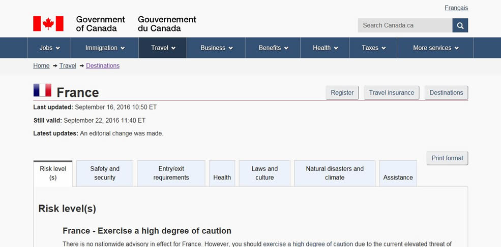
Remember: Putting everything in tabs restricts the ability for the page to grow. It also creates design constraints for existing content, which could become a barrier to good usability. For example, the more tabs there are, the less space is available for label text, reducing labels to keywords which may not be descriptive enough. Moreover, tabs tend to conceal important information. If there is value in having the content all on the same page, consider using a table of contents instead. It wouldn't have space restrictions for section headings and it could link to the information below it.
-
Fails: There is no general strict rule as to when there are simply too many links on a page, as it would depend on context. However, when information is organized by topic and you are expecting a user to make choices based on exploratory categories, having over 10 categories could be a good indicator that the IA might need improvement.
This page is a good example of the problem. "Childhood obesity", "Infant care" and "Safe sleep" should all be combined under a broader heading such as "Healthy children" or "Childhood health", which would reduce the number of options shown. This would also allow this page to continue to grow over time.
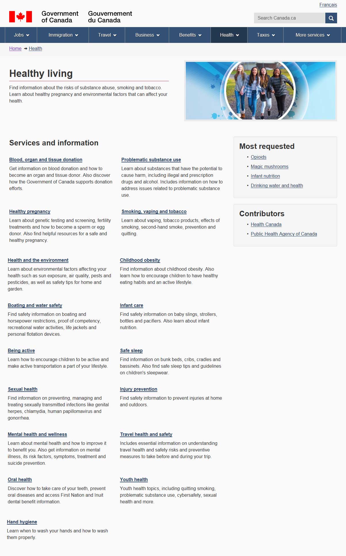
Remember: When there are a lot of options, you will need to see where items can be grouped, and move them to a new page or create further sub-headings. This will allow the parent page to continue to grow, while also offering the ability for the child page to grow meaningfully.
-
Fails: The horizontal design of the menu used to navigate between the seven steps in obtaining "EI Maternity and Parental Benefits", forces the buttons to be broken up over three rows. This visually splits up the process, and pushes the page content further down the screen. This multi-row design conflicts with the design goal of linearizing the process and becomes more problematic for processes that have 10+ steps, causing the navigation to spread over four or more rows.
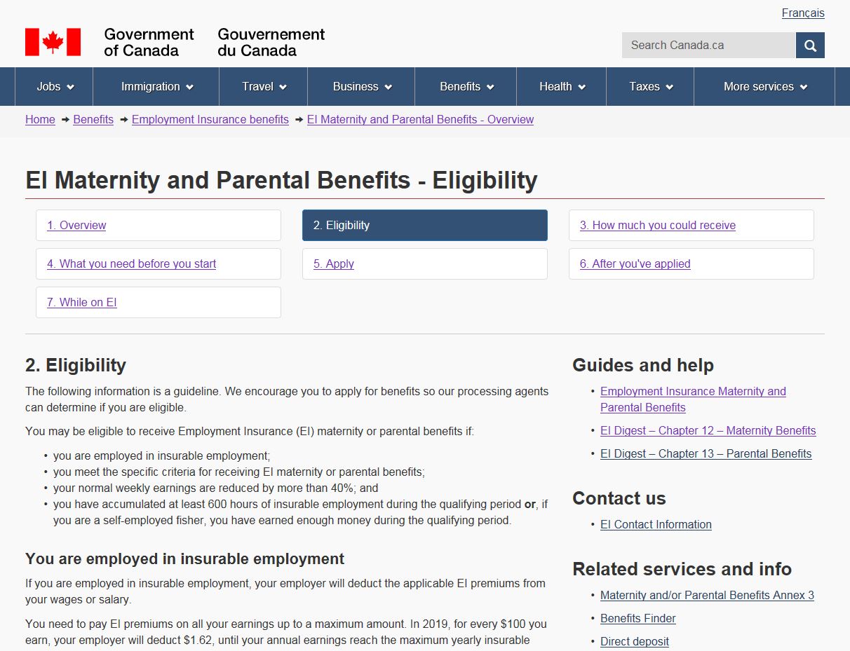
This use of a menu to replace a conventional table of contents also doesn't align with users’ previous experiences (mental models), where they would scan through a table of contents in a vertical manner, rather than navigating horizontally. This can create confusion and frustration, as the user's eye may scan in the following direction:
- 1. Overview
- 4. What you need before you start
- 7. While on EI
Remember: Horizontal menus always struggle to grow, as they are limited by the screen resolution of the user.
-
Fails: If a page has a modest amount of content, you would expect to see it all displayed when the page loads. As the content grows, there is often a desire to tidy up the visual look of the page. This can be done effectively by adding a table of contents above the content or by splitting up the content over several pages.
There shouldn't be a breakpoint in content volume, where you stop doing what every other page does (i.e. showing the content or linking to child pages) and implement a new design feature that hides the essential content from the user.This approach favours the convenience of making the page easy-on-the-eyes at the expense of poor discoverability and frustrating user-experience.
Remember: Overuse of the expand/hide feature is a sign that there may be too much content on a single page and/or there is lack of understanding of how this content is used. Instead of expand/hide, add a table of contents above the content (the links in the table of contents will be the same as the links in expand/hide, but the content is available below instead of being hidden) or break the content up and spread it over several pages.
-
Fails: The previous version of Canada.ca had a site-wide horizontal menu that had too many topics for the available space. This meant that some items got visibility while others, despite being at the same level of IA in the site, were nested under the last link called "More services". There were simply too many topics to feature for this design to work properly.

Note: The design was fixed in the new Canada.ca version.
Passes: The menu is accessed from a single "Menu" link. All topics are now treated the same way, and future topics can be added with no impact to the design.
Remember: Having a "More" link is a strong indicator the approach to structuring the information isn't designed to grow and may result in arbitrary or non-user-centric prioritization of some topics over others.
Take aways
The goal of this principle is to create an IA that allows content can grow over time. In order to achieve this, you must ensure that:
- content structure is robust and can tolerate additions
- page design allows for growth
- page design is capable of growth
All course sections
- Date modified: