Principle of objects
Read time: 5 minutes
On this page
Overview
Definition: Treat content as a living, breathing thing with a lifecycle, behaviours, and attributes.
In practice: A newsletter, photo gallery, learning product, procedure, contact directory, or policy are very different content types. Content types are digital objects and have their own lifecycle, as well as behaviours and attributes to meet the needs of the user and the business. These attributes should be formalised through consistent and repeatable design patterns specific to each content type.
On Canada.ca, a number of content types and design patterns have already been developed to support better design outcomes, you can find them through Content and Information Architecture Specification.
Examples
Passing examples
-
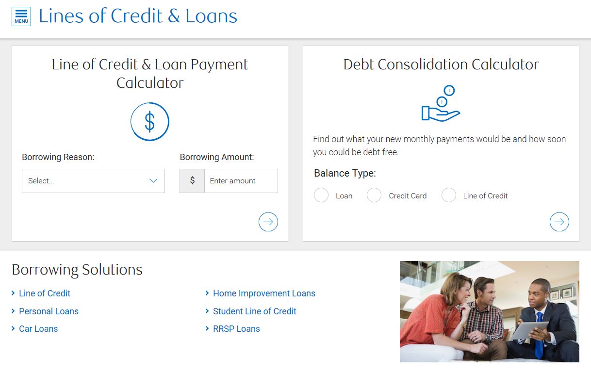
Passes: The two embedded calculators are treated the same, yet they are distinctly different from how the product navigation is treated.
Remember: Similar content types should be treated in a similar way.
-
Passes: The alert and the table of contents are each given their own design that best supports the content within them.
Remember: Content types that are different should be noticeably different.
-
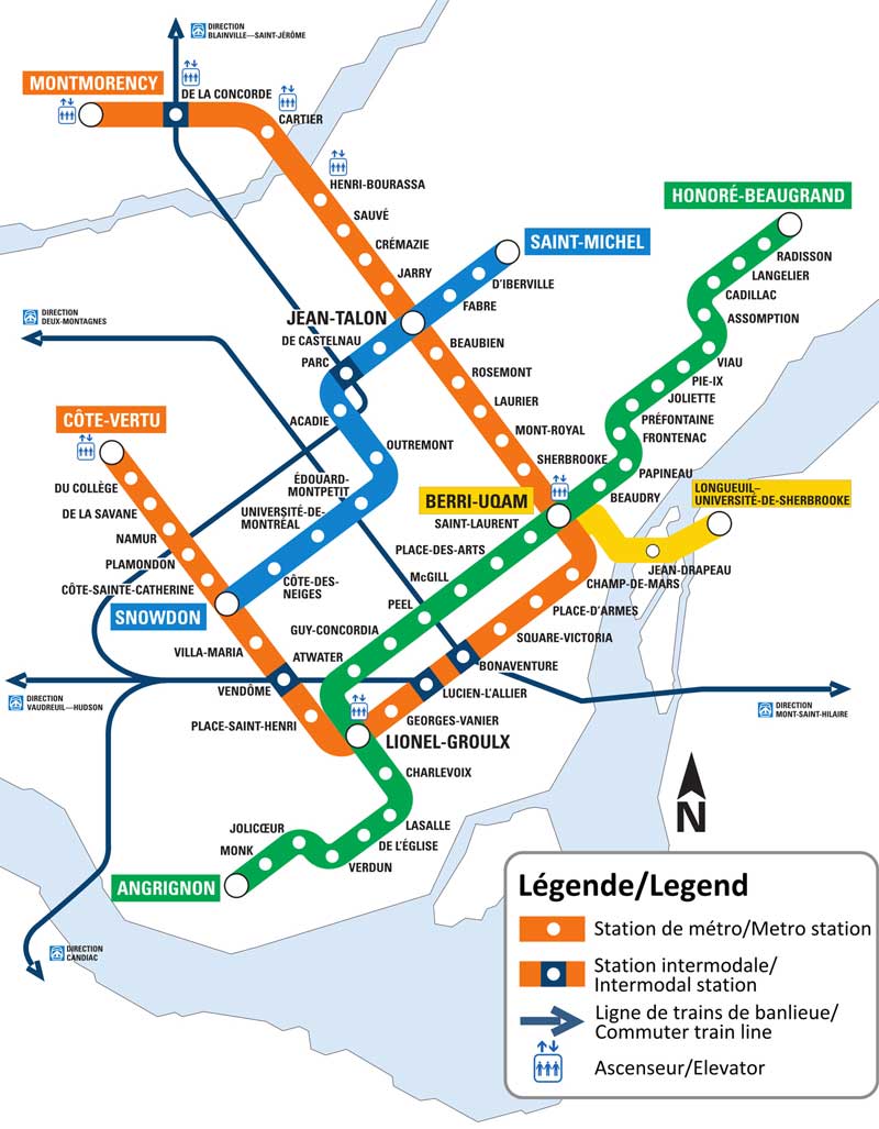
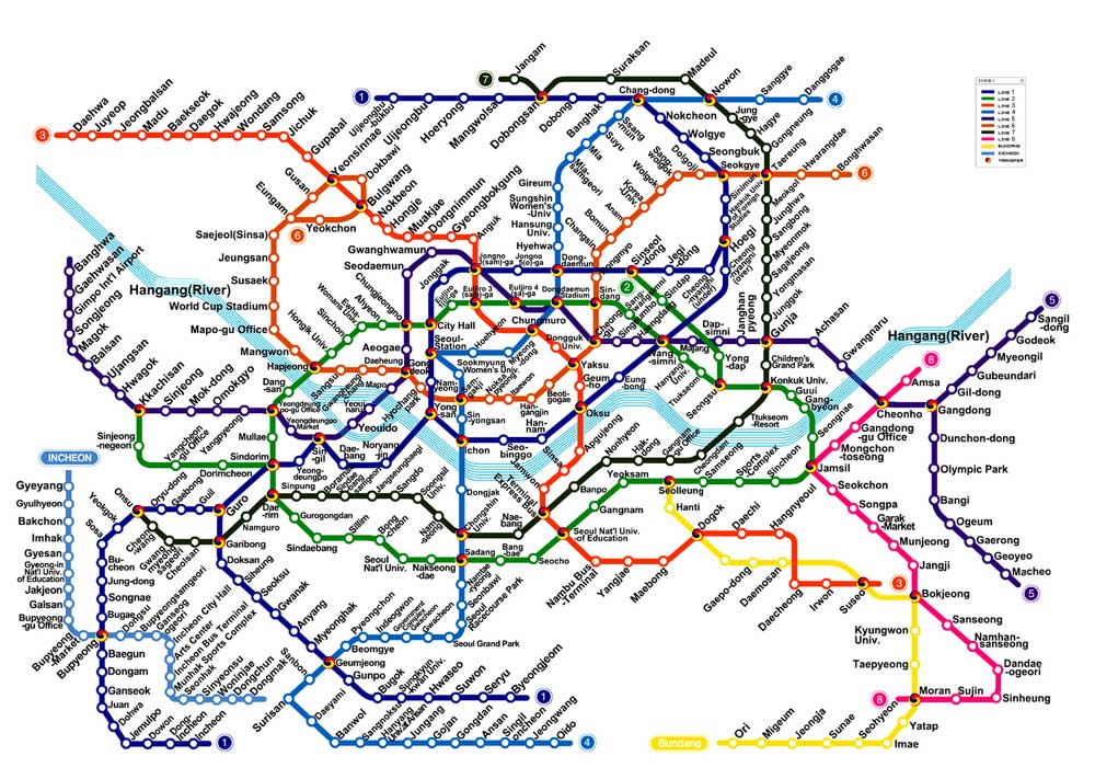
Passes: This is step 2 in a four-step process. The design is given a visual treatment that lets the user know how many steps there are, where they currently are in the process, and what steps have been completed.
Note: The above design mimics a pattern already in use, worldwide, for subway maps. A process and a subway are similar in that they take the individual from one spot to another, along a structured path.
Remember: Whenever appropriate, real world design and experience should influence website design patterns.
Failing examples
Disclaimer: Examples below are used for learning purposes to illustrate broken principles and their potential consequences, not to judge the organizations or people designing these interfaces.
-
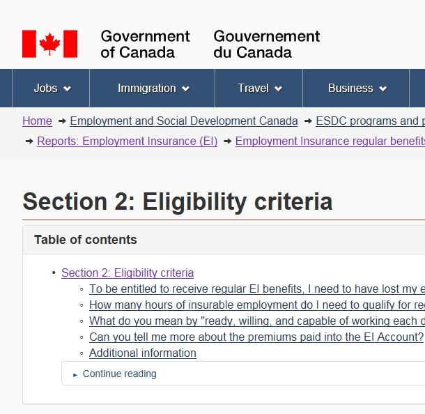
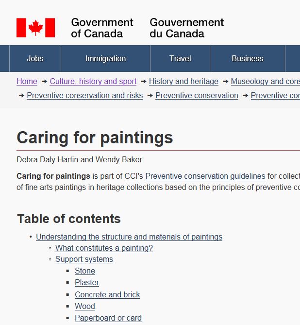
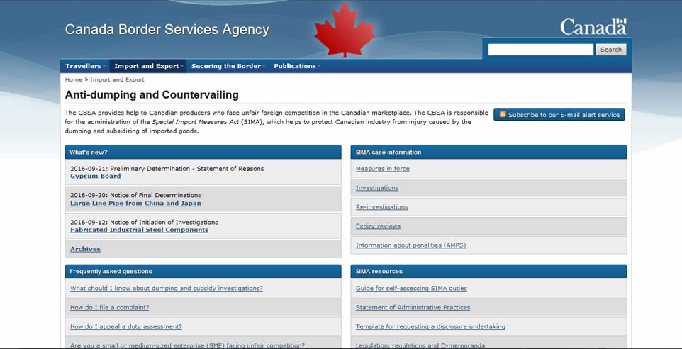
Fails: On the Canada.ca site, there are numerous ways to feature a table of contents that links down to the headings on that same page:
Remember: Be consistent. This is supported by the visual design principle, the Law of past experience, which states that users prefer similar things to work the same way. Predictability reduces cognitive load and allows users to complete tasks or find information faster.
-
Fails:Every piece of content is treated the same, despite the links being very different in scope and purpose.
Remember: Content needs to be optimized, not homogenized. Different types and pieces of content need to be easily distinguishable.
-
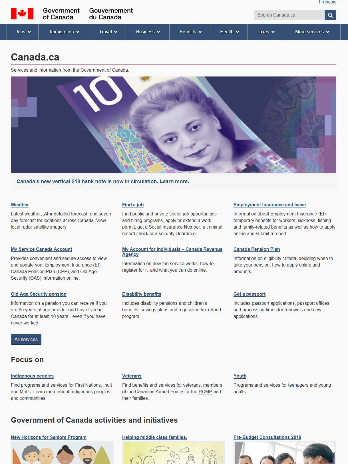
Fails: The previous version of Canada.ca featured the most popular links on their homepage, but used the same visual design in how they feature their topics and tasks in the rest of the site (i.e. the blocks of links with descriptive text in the main content area).
Note: The design was fixed in the new Canada.ca design.
Passes: There is a specific design treatment for "Most popular", distinguishing it from topic and task links.
Remember: Content that is different should be treated differently, both in placement and design.
Take aways
The goal of this principle is to show that content types can make content more distinct and usable. In order to achieve this, you must ensure that:
- content that is similar is treated in a similar way, distinct in design and placement from unrelated content
- content patterns are consistently applied
All course sections
- Date modified:

