Marketing and communications
Read time: 7 minutes
On this page
Overview
Marketing and communications have a common goal of messaging, but they are very different disciplines:
- Marketing is concerned with promoting and selling products or services
- Communications is focused on delivering and exchanging information
Within the public sector however, these disciplines tend to overlap, often focusing on handling public relations, improving the organization’s image or promoting services.
This focus on the organizational agenda can create friction with the user-centred language focus of IA.
How this affects IA
Both marketing and communications areas want their products or messaging to reach and influence the highest amount of targeted users, which means that they may want to raise the profile of the content they are showcasing.
This can be done successfully by giving the content a unique design treatment, or featuring it on relevant pages, while not affecting the IA.
-
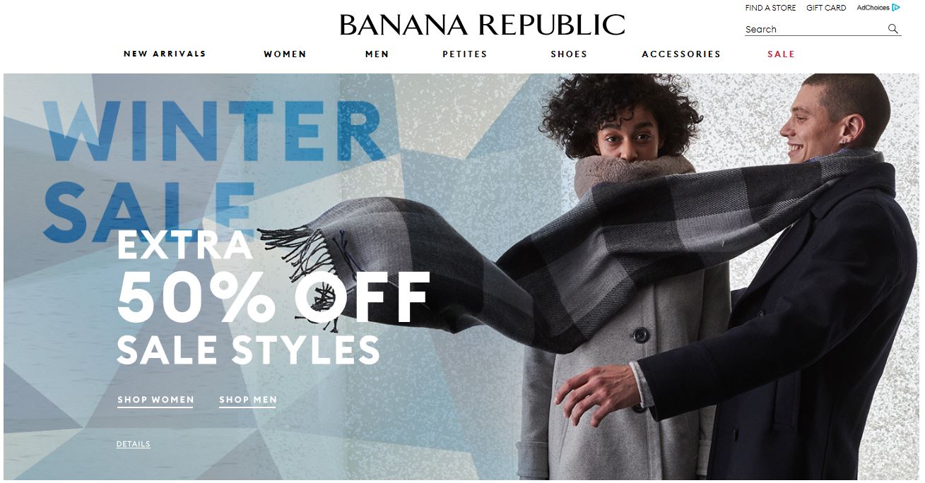
Passes: Marketing implements a campaign for end-of-season sales (window display signage, store signage, website imagery, social media, email blasts, etc.). As part of that, either marketing or communications pushes the 50% off notification to the website homepage. This doesn't affect the IA of the site, as the content on the homepage is always featuring the newest products and/or sales.
-
Passes: Communications wants you to know what's new and there is a call-out on the homepage with a unique design treatment to showcase the news.
When marketing and communications modify and impact the IA to have their products or messaging reach the highest amount of targeted users, there are problems created as a result.
Broken IA creates confusion and adds extra cognitive load for the user. It results in competing sources of information, more options and choices a user has to go through to find answers and to compare, to make sure nothing is missing, or to simply find what they need.
It also makes the organization appear untrustworthy, disorganized or worse, inconsiderate and lacking in empathy and understanding of its audience.
Disclaimer: Examples below are used for learning purposes to illustrate broken principles and their potential consequences, not to judge the organizations or people designing these interfaces.
For example:
-
Fails: Communications has a campaign to help citizens "Take charge of your finances".
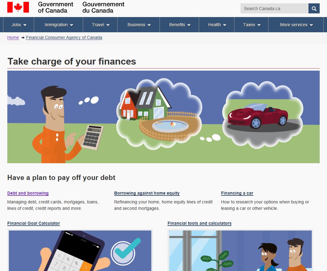
This campaign in itself isn't a problem. The problem arises because:
- The scope of the content only covers debt-related information and not savings-related information. Since the name of the page is "Take charge of your finances", it means the page title is out-of-sync with the content OR the page is missing important content.
- The featured links break the logical hierarchy by presenting parent (broader) and children (narrower)
topics side-by-side, at the same level. There is a:
- "Debt and borrowing" topic (the parent) next to "Borrowing against home equity" (its child topic) and "Financing a car" (its child topic)
- "Financial tools and calculators" topic (the parent) right next to "Financial goal calculator" (its child topic).
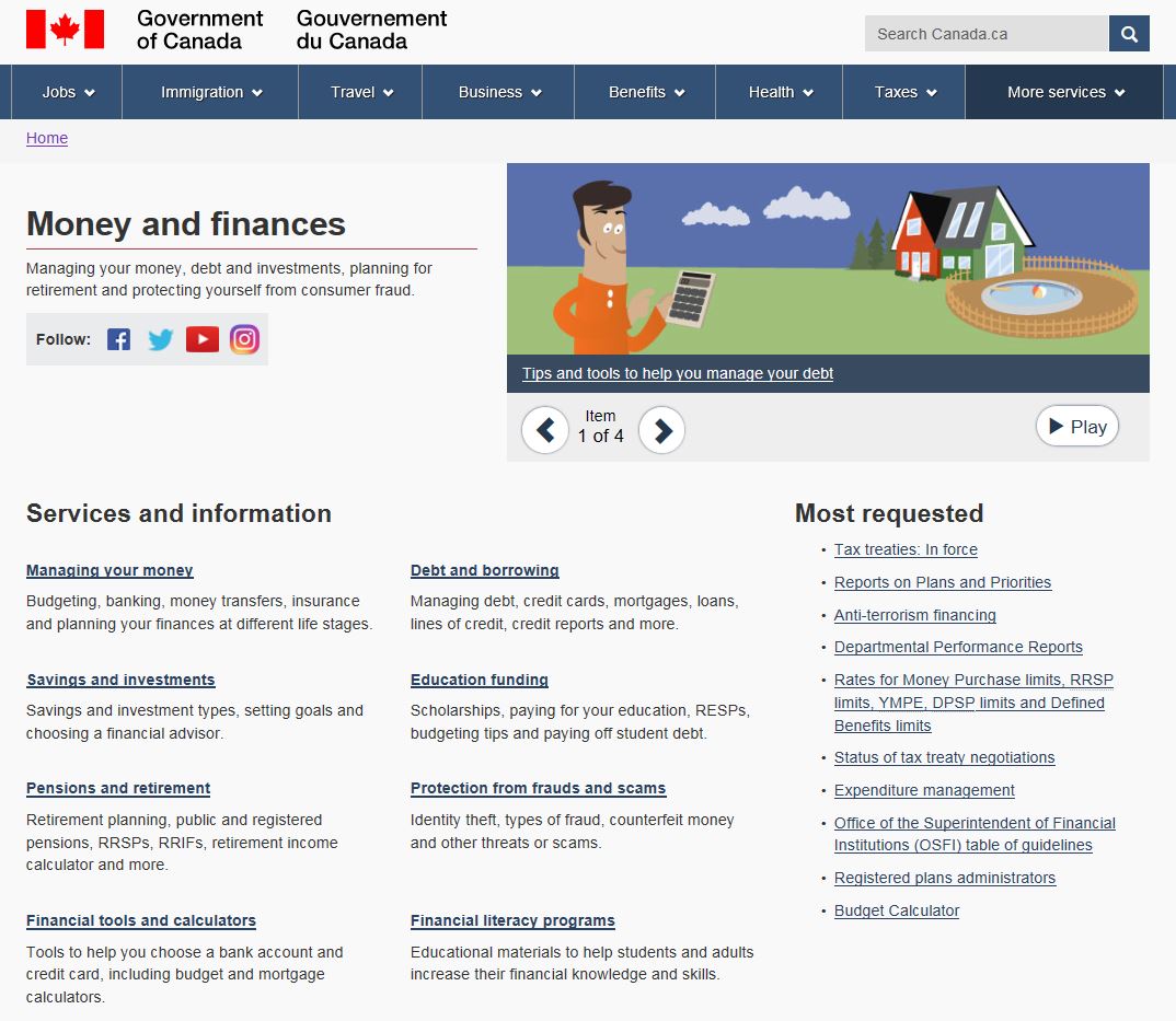
More importantly, there is already a page managed by this same department, that covers everything that would fit under the notion of "taking change of your finances" (debt, saving, investments, retirement, etc.). So the campaign page contains less information, yet competes with their more detailed authoritative page.
That's not to say there isn't a business need to have this campaign, or that there isn't a way to drive traffic to the relevant information, it's just that this specific implementation breaks the IA.
-
Fails: Marketing recognizes plus-sized and maternity clothing are key areas for their brand and adjust the IA to showcase them.
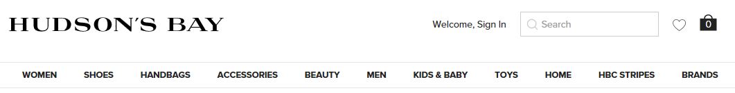
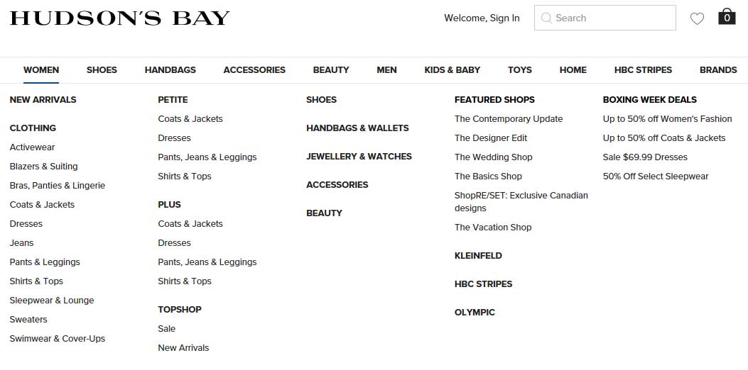
However, the first menu label is "Women". Based on a mental model a woman might have and the logic of the hybrid audience/age-based segmentation (IA) of the website, all women's clothing should be there. Yet, right beside the "Women" label are the "Women's Plus" and the "Maternity" labels. This doesn't make sense, as these two groupings are sub-categories of women’s clothing and should be disclosed progressively (once you click on or hover over “Women”) not at the same level.

This also doesn't make sense from a business perspective. When you hover over the "Women" menu item, the drop-down menu shows a sub-category for "Special sizes", but only "Petite" and "Tall" sizes are featured. If a visitor clicks or lands on the “Women” page directly and doesn't find maternity clothing there, the business may lose a sale.
"Women" mega-menu shows:
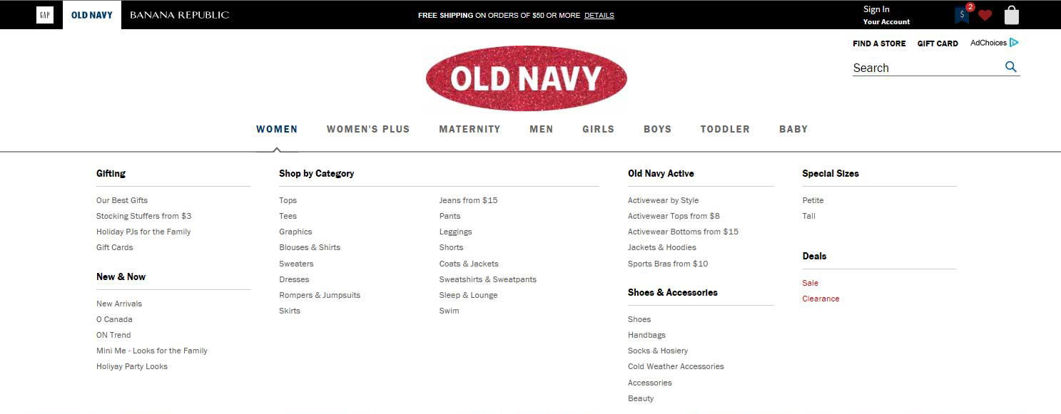
From an impact, ethics and inclusivity perspectives, while marketing is trying to elevate the "Women's Plus" and "Maternity" products, they are also excluding those users from first seeing themselves as "Women", despite giving "Petite" and "Tall" women the ability to shop as "Women".
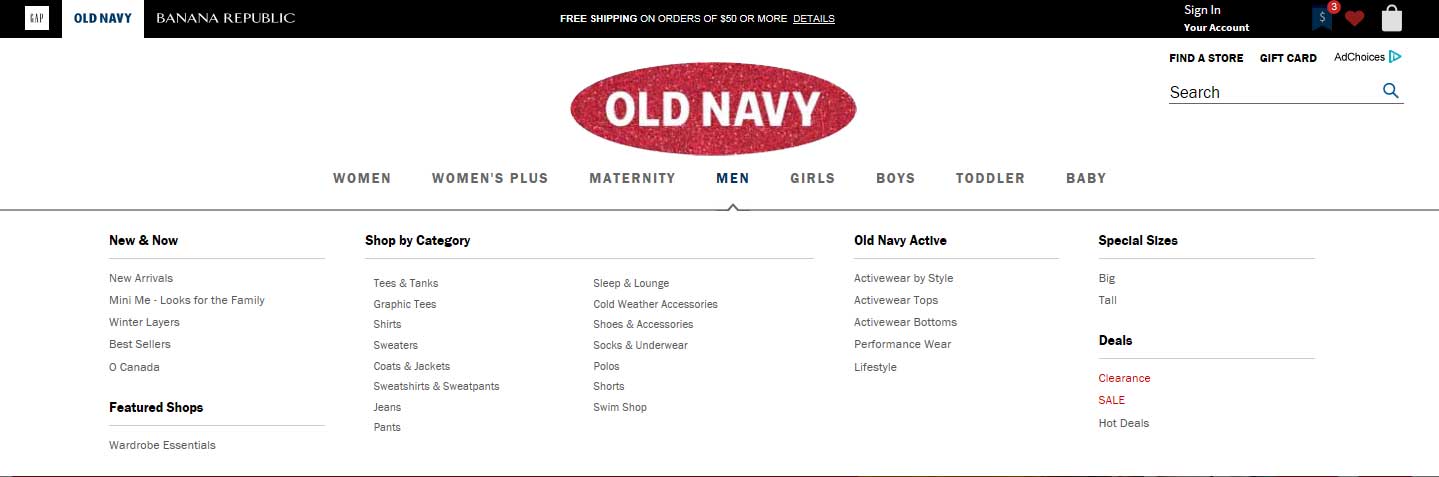
Yet under the "Men" menu item, the drop-down menu shows a sub-category for "Special sizes" featuring "Big" and "Tall" sizes. This means all men can shop the "Men" section.
"Men" mega-menu shows:
- It's worth noting that this approach is also used on other sites:
-
Fails: "Women" is at the same level as "Plus size"

-
Fails: "Women" is at the same level as "Women +"

-
Fails: "Women" is at the same level as "Plus size"
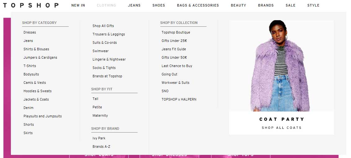
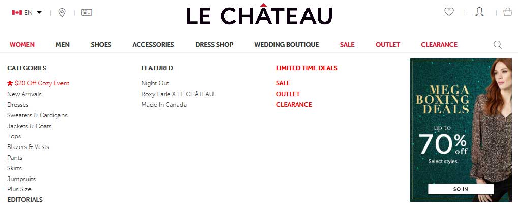
- Some sites have applied a more logical IA to women’s clothing:
-
Passes: "Clothing" has no competing menu item

...and the "Clothing" mega-menu has a "Shop by fit" section featuring "Tall", "Petite", and "Maternity".
-
Passes: "Women" has no competing menu item

...and the "Women" mega-menu has a "Plus size" section.
-
Passes: "Women" has no competing menu item
...and the "Women" mega-menu has "Petite" and "Plus" sections.
-
- It's worth noting that this approach is also used on other sites:
Take aways
- Although the above examples are mainly showcasing high-level website-wide IA, it's important to remember that IA applies to the broad site structure all the way down to page-specific content placement and design.
- At any point, on any page, marketing and communications may have business needs that risk breaking IA.
- To create systems that are coherent and frictionless for your users, you must work with other disciplines and stakeholders to help them meet their goal and understand yours (IA).
- Always be reassessing, sometimes adjusting, but most of the time reinforcing the IA foundation, that makes sure all content on the site meets user needs.
Remember, IA is a lasting foundation that is bigger in scope and impact than any specific campaign, marketing goal or messaging.
All course sections
- Date modified: